If you are using Ella Shopify theme Version 6-7-0 or lower. You must be seeing that the menu is not working on mobile phones. You will see the menu is not loading and just shows the menu loading animation, like the Image on the right.
I have been searching the internet and found no solution that works for me.
So after applying the available solutions and getting frustrated, I decided that I would replace the menu.

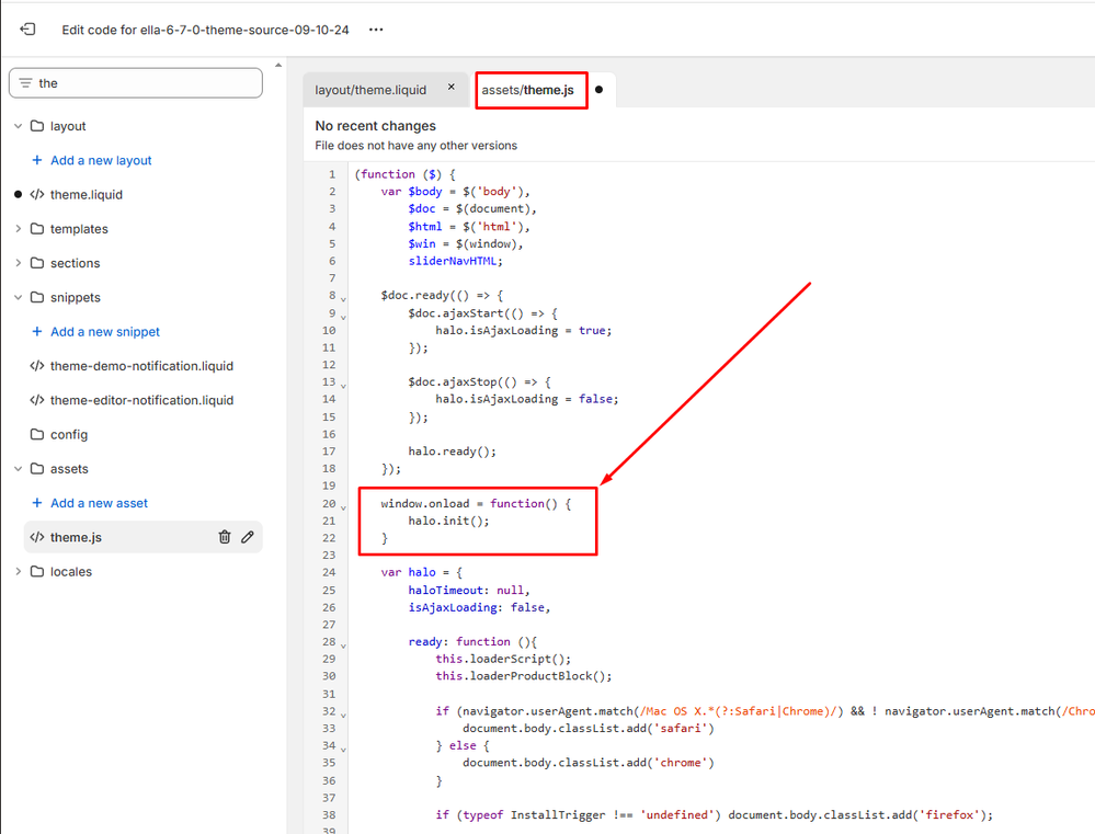
First thing first. If you have applied the below code as a solution. Please revert to the original. If you use this, your close button will not work and it will be the worst you can see after fixing the menu.
            document.addEventListener("DOMContentLoaded", function () {
    halo.init();
});
The Solution:
Ok, let’s replace the prebuilt mega-menu with, the normal menu. Check the code and it should be working.
Go to Online Store > Themes > Edit Code.
Search for halo-sidebar-menu.liquid file and open in the editor.
Find for below code which starts from line 3 till line 25.
You have to remove the below code.
                  {%- if settings.mobile_menu == 'default' -%}
        <div class="site-nav-mobile nav-menu-tab"></div>
        <div class="site-nav-mobile nav" data-navigation-mobile>
          <div class="menu-heading-mobile halo-sidebar-header">
            <span class="title">{{ 'general.common.menu' | t }}</span>
            <button type="button" class="halo-sidebar-close" data-menu-close-sidebar aria-label="{{ 'general.common.close' | t }}">{% render 'icon-close' %}{{ 'general.common.close' | t }}</button>
          </div>
          <ul class="list-menu-loading" role="list">
            {%- for i in (1..8)-%}
              <li class="list-menu-loading__item"></li>
            {%- endfor -%}
          </ul>
        </div>
      {%- else -%}
        <div class="site-nav-mobile nav-menu-tab nav-mobile-menu-tab" data-navigation-tab-mobile></div>
        <button type="button" class="halo-sidebar-close halo-sidebar-close-custom" data-menu-close-sidebar aria-label="{{ 'general.common.close' | t }}">{% render 'icon-close' %}{{ 'general.common.close' | t }}</button>
        <div class="site-nav-mobile nav menu-custom-mobile" data-navigation-mobile></div>
        <ul class="list-menu-loading" role="list">
          {%- for i in (1..9)-%}
            <li class="list-menu-loading__item"></li>
          {%- endfor -%}
        </ul>
      {%- endif -%}
HTML Code to be added in the file.
            <button type="button" class="halo-sidebar-close" data-menu-close-sidebar aria-label="{{ 'general.common.close' | t }}">{% render 'icon-close' %}{{ 'general.common.close' | t }}</button>


{% comment %} Menu HTML Structure {% endcomment %}
<nav class="mobile-accordion">
  <ul class="mobile-menu">
    {% for link in linklists.main-menu.links %}
      <li class="menu-item {% if link.links != blank %}has-submenu{% endif %}">
        <div class="menu-item-inner">
          <a href="{{ link.url }}" class="menu-link">{{ link.title }}</a>
          {% if link.links != blank %}
            <button class="menu-toggle" aria-label="Toggle submenu">
              <span class="toggle-icon">+</span>
            </button>
          {% endif %}
        </div>

        {% if link.links != blank %}
          <ul class="submenu">
            {% for child_link in link.links %}
              <li class="submenu-item {% if child_link.links != blank %}has-nested-submenu{% endif %}">
                <div class="submenu-item-inner">
                  <a href="{{ child_link.url }}" class="submenu-link">{{ child_link.title }}</a>
                  {% if child_link.links != blank %}
                    <button class="submenu-toggle" aria-label="Toggle nested submenu">
                      <span class="toggle-icon">+</span>
                    </button>
                  {% endif %}
                </div>

                {% if child_link.links != blank %}
                  <ul class="nested-submenu">
                    {% for grandchild_link in child_link.links %}
                      <li class="nested-submenu-item">
                        <a href="{{ grandchild_link.url }}" class="nested-submenu-link">{{ grandchild_link.title }}</a>
                      </li>
                    {% endfor %}
                  </ul>
                {% endif %}
              </li>
            {% endfor %}
          </ul>
        {% endif %}
      </li>
    {% endfor %}
  </ul>
</nav>
{% for link in linklists.main-menu.links %}
Replace the main-menu with your menu name found in your navigation.
CSS Code to be added in the file.
             .mobile-accordion {
    width: 100%;
  }

  .mobile-menu,
  .submenu,
  .nested-submenu {
    list-style: none;
    padding: 0;
    margin: 0;
  }

  .menu-item {
    border-bottom: 1px solid #eee;
  }

  .menu-item-inner,
  .submenu-item-inner {
    display: flex;
    justify-content: space-between;
    align-items: center;
  }

  .menu-link,
  .submenu-link,
  .nested-submenu-link {
    padding: 12px 15px;
    flex-grow: 1;
    text-decoration: none;
    color: #333;
  }

  .menu-toggle,
  .submenu-toggle {
    background: none;
    border: none;
    padding: 12px 15px;
    cursor: pointer;
    font-size: 1.2em;
  }

  .submenu,
  .nested-submenu {
    max-height: 0;
    overflow: hidden;
    transition: max-height 0.3s ease-out;
  }

  .submenu .submenu {
    padding-left: 20px;
  }

  .nested-submenu {
    padding-left: 30px;
  }

  .submenu.active,
  .nested-submenu.active {
    max-height: 1000px;
    transition: max-height 0.5s ease-in;
  }

  .menu-toggle.active .toggle-icon,
  .submenu-toggle.active .toggle-icon {
    transform: rotate(45deg);
  }

  .toggle-icon {
    display: inline-block;
    transition: transform 0.3s ease;
  }
Javascript Code to be added in the file.
            document.addEventListener('DOMContentLoaded', function() {
  // Toggle submenus
  document.querySelectorAll('.menu-toggle, .submenu-toggle').forEach(toggle => {
    toggle.addEventListener('click', function(e) {
      e.stopPropagation();
      const parentItem = this.closest('.has-submenu, .has-nested-submenu');
      const submenu = parentItem.querySelector('.submenu, .nested-submenu');
      const isOpen = submenu.classList.contains('active');

      // Close other submenus at the same level
      if (!isOpen) {
        const siblings = Array.from(parentItem.parentElement.children);
        siblings.forEach(item => {
          if (item !== parentItem) {
            item.querySelector('.submenu, .nested-submenu')?.classList.remove('active');
            item.querySelector('.menu-toggle, .submenu-toggle')?.classList.remove('active');
          }
        });
      }

      // Toggle current submenu
      submenu.classList.toggle('active');
      this.classList.toggle('active');
      this.setAttribute('aria-expanded', !isOpen);
    });
  });

  // Handle link clicks
  document.querySelectorAll('.menu-link, .submenu-link').forEach(link => {
    link.addEventListener('click', function(e) {
      // Only follow link if submenu is already open or there's no submenu
      const parentItem = this.closest('.has-submenu, .has-nested-submenu');
      if (!parentItem || parentItem.querySelector('.submenu.active, .nested-submenu.active')) {
        return true; // Allow default link behavior
      }

      // Prevent default if submenu exists and is closed
      if (parentItem) {
        e.preventDefault();
        parentItem.querySelector('.menu-toggle, .submenu-toggle').click();
      }
    });
  });
});
You can place these scripts in respective CSS and JS files or in the same file it depends on you. When you replace this code, the menu on your phone will work like an accordion.
If you have any issues you can leave a comment below or reach me to fix it for you.